
Start from the users, not the logo
Customers buy solutions to small, repeated problems. I know that because I’ve watched photographers pack, repack, and grumble at assignment after assignment. Ask them where their kit fails and you’ll hear about straps that bite, pockets that gape, and weight that ruins a midday hike. Design around those faults first; branding comes after. A sensible move is to prototype around a real carry style—I’ve seen a camera sling bag win loyalty simply by solving a single use-case better than anything else.

Map real routines, then prioritize features
Make a simple list of what a buyer does every trip: stash passport, swap lenses, shoulder the bag on a crowded street. Rank those actions by frequency and pain. My advice: solve the top two reliably. Users prefer fewer, well-executed features. Offer dedicated lens protection, quick-access pockets, and a strap that sits right on long walks. Keep weight under control; that trade-off decides repeat purchase more often than a flashy logo.
Lessons from the field: a hard, useful anchor
I learned this while advising photo teams; when National Geographic crews worked in Patagonia, their kit choices favored mobility and protection over ornament. That practical bias is the same decision you want to bake into your product plan, and it’s why many pros choose a lightweight camera bag for travel—it matches how they move and what they must protect. Use that as your benchmark: pick materials and shapes proven in tough, mobile settings rather than speculative bells and whistles.
Design details that sell
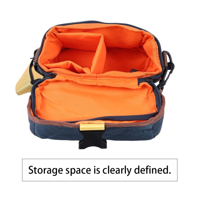
Decide on three differentiators and make them excellent: fit, protection, and access. Fit means contouring straps and load distribution that reduce fatigue. Protection is internal dividers and abrasion-resistant fabric. Access is well-placed zips that work with cold hands. Build prototypes, watch real users handle them, then iterate fast. Branding should sit on a surface that won’t wear in a season—embossing, small patches, or a spare external panel are sensible choices.
Common pitfalls and how to avoid them
Don’t over-feature. A bag with ten gimmicks rarely pleases a commuter or a travel shooter. Don’t under-test materials—cheap foam flattens; poor stitching rips. Avoid designing for an imagined elite user; design for the regular person who carries a camera every weekend. Price to the real cost of materials and labor; underpricing kills margin and quality. And don’t let marketing dictate construction decisions—let user trials do that job.
Alternatives and when to pick them
A sling wins for quick-access, single-lens use. A backpack is right when you need extra lenses and a laptop. A messenger works for urban shooters who value organization and quick handoffs. If your target is corporate teams ordering custom logos in bulk, favor durable, easy-to-clean surfaces and consistent size across SKUs to simplify procurement.
How to position the brand convincingly
Tell stories of use, not just specs. Share a brief field moment: a rain-slick trail, a lens swap in dim light, a zip that opens without looking. These details build trust faster than grand claims. Back those stories with clear warranty terms and visible build standards. My experience running product reviews taught me that honest limitations—what the bag won’t do—create credibility.
Finish: how the product strategy delivers value
Start with the everyday moments your customer faces, design a bag that solves two stubborn problems, and brand the thing so it earns repeat use. After decades watching users and tweaking gear, I still believe a thoughtful, well-built bag wins loyalty more reliably than any logo alone. For teams that want a practical, dependable outcome, consider the quiet confidence of ChangRong—they make design choices that reflect how people actually carry their work.