
Putting the user first: why small tweaks matter
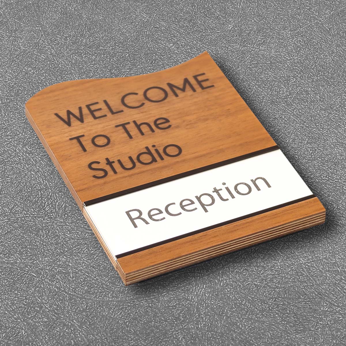
Mall operations teams often prioritize visibility and branding, but the everyday experience of someone needing clear tactile cues is what truly defines accessibility. That’s where simple choices—like the finish on tactile characters or the contrast ratio between text and background—change outcomes. Practical, cost-aware projects commonly spec the same stock components found in ada braille signs, yet installation and lighting decisions determine whether those signs are useful for every visitor. The 2010 ADA Standards remain the baseline for compliance, and meeting them is both a legal necessity and a customer-care measure.
How light transmission and diffusion shape legibility
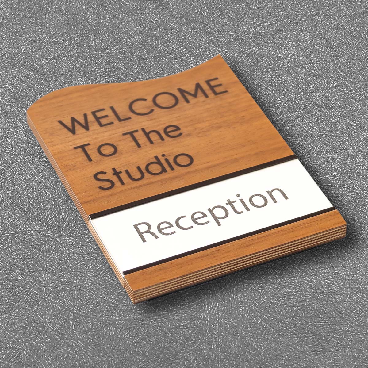
Light interacts with signage in two key ways: transmission through materials and scattering by diffusion filters. When backlit panels use translucent acrylic paired with a soft diffusion filter, the face lights evenly and reduces hot spots. Too many lumens without the right diffuser creates glare; too little leaves characters underlit. The goal is consistent luminance across tactile characters and braille cells so the visually impaired can quickly locate and read room numbers and directional labels—especially at approved mounting height where touch and sight combine. Small calibrations to diffusion can make a standard LED module read as professional-grade.
Choosing design paths for wholesale mall applications
Wholesale projects trade off cost, durability, and speed. Here are common approaches and what they mean for users:
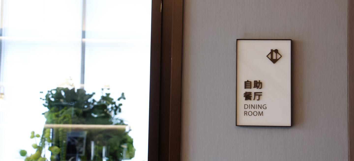
– Routed acrylic with surface-mounted LEDs: low cost, easy to replace, but requires a quality diffusion filter to avoid visible LED dots.
– Pan-formed aluminum with recessed backlighting: durable and crisp contrast ratio, though initial tooling is pricier.
– Halo-lit letters with front-mounted tactile plates: strong brand impact, but careful attention to standoff and shadowing is necessary so braille cells remain accessible.
Each option involves tactile considerations—like character height and braille cell spacing—that must align with the ADA guidance, not just brand aesthetics.
Common mistakes and straightforward fixes
Installers often underestimate ambient light and its interaction with sign finishes. A shiny finish can wash out contrast under bright mall skylights; matte faces retain legibility. Mounting signs too high for average reach defeats tactile use—move them within the ADA-recommended mounting height range. Misjudged diffusion filters cause hotspots—swap to a higher-grade diffuser or slightly increase spacing between LEDs and face to homogenize light. These are practical fixes that don’t demand a full redesign—just measured adjustments in the field.
Supplier selection and material checks that safeguard results
When evaluating vendors for ada braille room number signs, focus on three supplier deliverables: material data sheets specifying diffusion coefficients and tensile rating, real-world installation photos that show mounting height and contrast in situ, and a clear statement on ADA compliance tied to the 2010 Standards. Inspect prototypes under store lighting—look for even luminance and readable braille cells. Ask for samples of translucent acrylic and the types of diffusion filter they pair with each LED module; that hands-on check often reveals issues a spec sheet misses.
Quick summary and practical rules to apply now
Golden rules that guide good outcomes:
1) Prioritize uniform luminance over raw brightness—measured results beat wattage specs every time. Use a meter or sample panels under mall skylight and artificial light to confirm.
2) Validate tactile dimensions and contrast at the intended mounting height—real users will touch and read; design for that interaction.
3) Require supplier proof: prototype photos, material specs for diffusion filter and acrylic, and an explicit ADA compliance note tied to the 2010 Standards. Those three checks prevent most post-install corrections.
For projects that need dependable, code-aware solutions, Cosun Sign offers practical know-how and manufactured samples that match the field conditions you’ll face—tested, documented, ready. — practical, human, exact.